ShopDreamUp AI ArtDreamUp
Deviation Actions


Suggested Collections


You Might Like…


Featured in Groups


Description
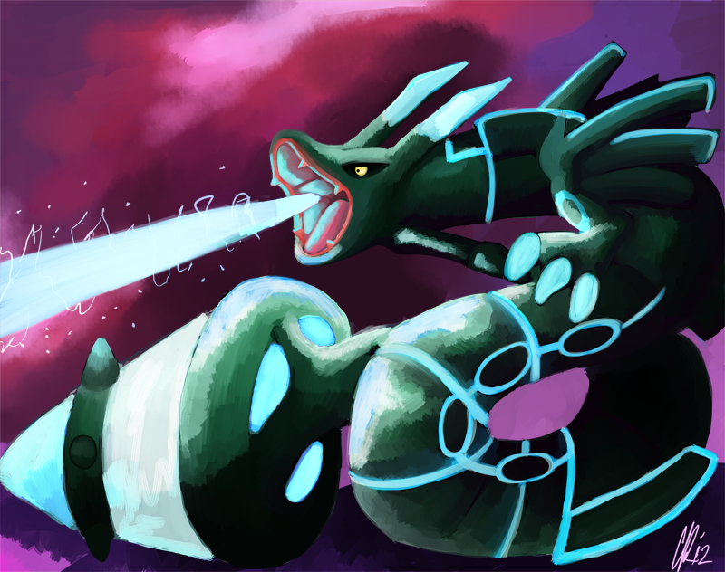
If only this was real, I decided to do an fanart of  Zekruyza which i renamed . I could'nt get all of the details frist time I'm drawing a Rayquaza let alone a fusion of him but I thought it was cool. Warning i just noticed that i have to fix the tail. so this will be updated.
Original -> [link]
Zekquaza/Zekruyza © by
Pokemon © by Nintendo ©2012
Art by ©2012
©2012
Zekruyza which i renamed . I could'nt get all of the details frist time I'm drawing a Rayquaza let alone a fusion of him but I thought it was cool. Warning i just noticed that i have to fix the tail. so this will be updated.Original -> [link]
Zekquaza/Zekruyza © by
Pokemon © by Nintendo ©2012
Art by
©2012Image size
800x632px 593.99 KB
© 2012 - 2024 Phatmon
Comments57
Join the community to add your comment. Already a deviant? Log In
Vision 4* - I like the idea. Really cool having a Zekrom/Rayuaza fusion. You might want to work on the mouth as it seems to resemble a sock puppet.
Originality 3* - I have seen a lot of fake fusions of pokemon and although I have not seen this one, it's undistinguishable from the rest.
Technique 3 1/2* - What I expected from a Zekrom/ Rayquaza fusion was sharper features and great contrast in lighting/shading. The mouth and claws are too rounded in my opinion so the menacing effect is kinda shot. What I do like is how well you were able to bring out the light from the pattern on this fusion. You did well with reflection from the end of the tail to the coil. I also like how you were able to make the fused pokemon completely pop out from the purple background. Great shading as well... brings back the menacing tone of the work.
Impact 4* - I feel as if you should continue fusing pokemon. You give me the impressio that you have a lot more good ideas and I enjoy looking at this painting.
All in all, this was a decent fusion. Work on the features that should be sharper to keep the feel of the piece constant. Great work on shading, blending, and lighting. It really saves the piece, so good job. I like this and keep up the good work. <img src="e.deviantart.net/emoticons/b/b…" width="15" height="15" alt="